KPI Widgets (Key Performance Indicators):
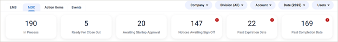
KPI widgets appear at the top of each dashboard view and provide a quick summary of high-priority information.
These widgets are grouped in a logical order to help you quickly identify items that may need attention, such as:
- Notices awaiting sign-off
- Items past their expiration date
- Items past their completion date
Some KPI widgets include an icon that serves as a visual indicator, making it easier to spot important information quickly.
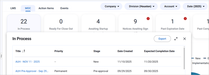
Interactive KPI Widgets
KPI widgets are interactive. Clicking a KPI widget opens a data table pop-out showing the list of items related to that KPI.
From the data table pop-out, you can:
-
View a detailed list of items that need attention
-
Export the list to Excel
-
Click links to open related MOC or Event summaries (based on your permissions)
Quick Filters
Quick Filters allow you to adjust the data shown across the entire dashboard without leaving the page:
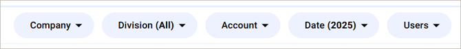
When you apply a Quick Filter, all KPI's and charts update automatically.
You will see the following filter options:
- Company – Filters dashboard data to a specific company.
- Division – Limits data to a selected division within a company.
- Account – Displays data for a specific account. (Not Available on the LMS Module).
- Date – Adjusts the time period shown on the dashboard.
- Users - Filters dashboard data to one or more selected users as well as 'Myself'(availability depends on your role and permissions).
Data Refresh Interval
Dashboards update automatically at set intervals.
In the bottom-right corner of the dashboard, you will see a timestamp showing when the data was last refreshed.
- Last updated at [XX:XX]
Hovering over the timestamp displays: a dynamic countdown showing when the next refresh will occur which is set for every 5 minutes.
- Next update in [XX:XX]
This helps confirm when the dashboard data was last updated and when it will refresh again.
Widget-Level Filtering
Widget-level filtering is available on bar chart widgets only
Some widgets support widget-level filtering, which applies only to the selected widget and does not affect the rest of the dashboard.
-
This type of filtering occurs when you interact directly with the chart
-
Widget-level filters work in combination with Quick Filters
Drill-Down Functionality
Drill-down allows you to click on a chart to view more detailed information related to a specific data point.
Drill-down is available on certain bar charts only. Other chart types, such as pie or donut charts, do not support drill-down.
Default View vs Drill-Down View
- The default view displays a high-level summary of data in a bar chart
- The drill-down view shows more detailed data based on your selection
To drill down:
- Click a bar in the chart to view a more detailed breakdown of the selected data.
- The chart updates to display a view related to that selection.
- Click a bar again in the drill-down view to open a data table pop-out.
- The data table pop-out displays a list of related records (such as MOCs). From this table, you can click a record link to open the applicable summary page, based on your permissions.
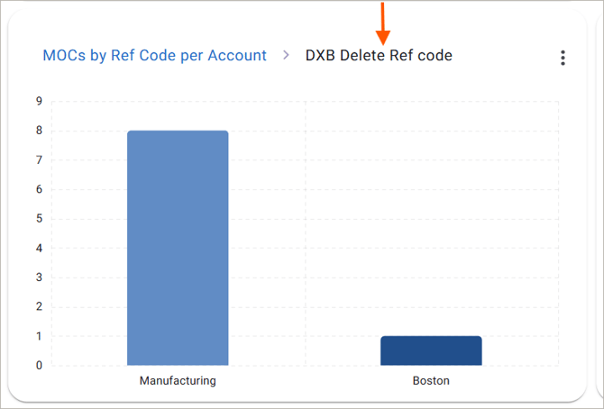
Breadcrumb Navigation
When you drill down, a breadcrumb appears at the top of the chart as part of the chart title.
The breadcrumb helps you understand where you are in the data and always shows:
- The active drill-down view displayed in black, based on your selected data
- To go back to the previous default view simply click on the breadcrumb (MOCs by Ref Code per Account in this example)
Returning to the Default Chart View
To return to the original chart view:
- Click the original chart title in the breadcrumb
The chart will reset to the default bar chart view.
Data Tables
All widgets in every dashboard view include data tables, which provide detailed, row-level information that supports the visual charts.
Data tables provide detailed, row-level information that supports the visual charts they are generated from.
You can use tables to:
- Review exact values
- Scan detailed records
- Compare individual data points
Pan and Zoom (Bar Charts)
Pan and Zoom features help you explore charts with a large amount of data.
These features are available on all chart types, except donut charts.
Pan
Click once within the chart grid before attempting to click and drag for panning
- Click and drag left or right on an empty area of the chart
- This allows you to view additional data along the X-axis
Click once within the chart grid before attempting to click and drag for panning
Zoom
- Use your mouse wheel to zoom in or out
- Zooming in focuses on fewer data points
- Zooming out returns to the default view
Exporting
Dashboard data can be exported to support offline review, sharing, or reporting. Export options vary depending on whether you are exporting a chart or a data table.
Exporting Data Tables:
Data tables can be exported from data table pop-outs.
To export a data table:
- Open a KPI or chart widget.
- Click the pop-out icon in the top-right corner of the widget.
- In the pop-out view, click Export to download the table as an Excel file.
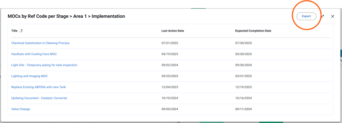
Exported data tables reflect the current filters applied to the dashboard and widget.
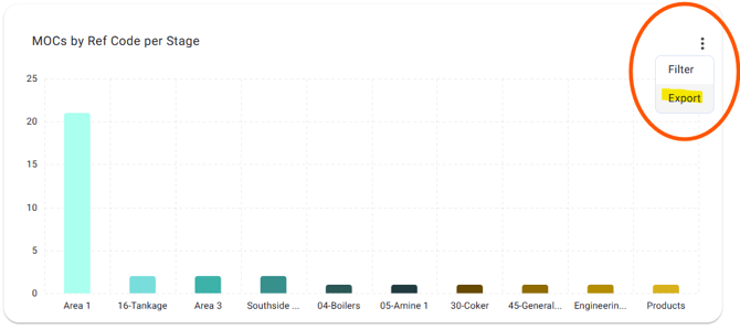
Exporting Chart Visualizations
Charts can be exported from the chart widget
To export a chart visualization:
- Go to the desired chart widget.
- Click the three dots in the top-right corner of the widget and select export.
- This will launch the Chart Visualization into a .pdf file on your browser.